
The 2023-24 season was my first season at Omaha Community Playhouse as the Art Director, and coming in right at the beginning posed several challenges. I had to take the small amount of work that had already been done on Beautiful and the existing brand standards to bring a new look to all of the productions for the rest of the season.
Working alongside the production-side Artistic Directors, I concepted, developed, and iterated on show artwork. From there, I scheduled and art directed promotional photoshoots, edited the resulting photography, and synthesized the previous show artwork into key art and supporting hero images. These were then reworked into several formats for social media marketing, website display and print.

Beautiful: The Carole King Musical
August 2023
Beautiful was the first production that I worked on as Art Director at OCP. The promotional photography had already taken place by the time that I stepped in, so I was tasked with executing on the Artistic Director’s vision. I rendered the musical sheets falling around the actress to give the key art a sense of space.


Pipeline
September 2023
Pipeline is a contemplative show about familial expectations and the “pipeline” from schools to the prison system for black youths in America. With such heady topics, the artwork had to lean darker and focus in on the actors’ emotions. The motif of the composition notebook provides a nice textural element.


The Play That Goes Wrong
December 2023
It takes a lot of precision to make a comedy about a play where EVERYTHING goes wrong look effortless. For this “play within a play” I used the actual scene plot as a grounding illustrative element, and spliced in the promotional photography of the actors in a Brady Bunch-esque interaction. When I designed the logo, I focused on the chandelier that crashes in the second act to imply a sense of things being off-kilter in this show.

I attempted a pop art illustration based on one of the photographs from the promotional shoot. It was rejected on the basis of being too far afield from the rest of our promotional materials. I agree, but it was still fun to put together.
This iteration also includes a prior version of the logo, which was modeled after a marquee with some grit.
Cabaret
January 2024
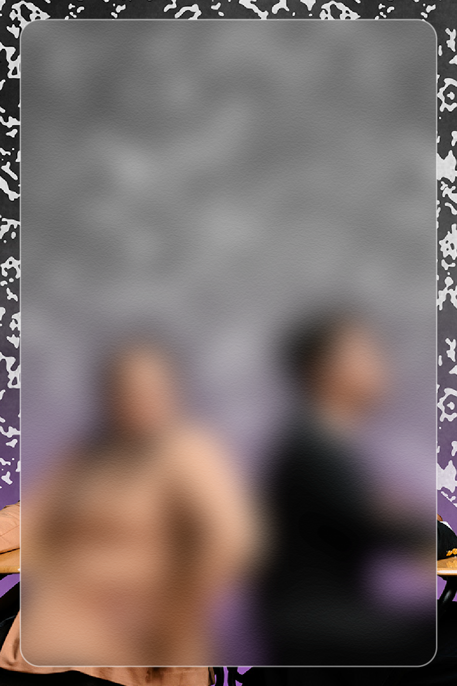
Cabaret is probably my favorite piece of theater of all time, so given the opportunity to promote it, I went all out. The vision that the director had was a dark, glitzy iteration of the show, so I leaned into that with the art direction. The logotype was designed with actual gold foil, and the promotional photography featured the suggestion of the actors being unclothed with some clever editing.


Below are a couple iterations that I worked up before the vision of the show took full shape. One of which leans heavily into the nazi references, with a fraktur type and a lone stocking poking up into the type. I never expected this iteration to make it far, but Cabaret has been marketed with those themes more overtly in the past by other theaters.
The other iteration, with the neon microphone, almost got approved, but it strayed a bit too far from the gold-infused vision of the director.

Ken Ludwig’s
Baskerville
A Sherlock Holmes Story
February 2025
An adaptation of one of the most beloved of Sir Arthur Conan Doyle’s stories, Baskerville is a bit of a farcical spin on “The Hound of The Baskervilles”. As such, in the promotional photography we really wanted to play up the comedic tones. Adding a daguerrotype effect on top really cemented the key art.
For the logo itself, the lockup came together very quickly. The houndstooth pattern of Sherlock’s cap makes an appearance as a texture (it seemed to fitting to leave out), and the tail of the hound is taken from some of the type ornaments.


Chicken & Biscuits
March 2025
A play about a death in the family doesn’t seem like the most likely scenario for a comedic exploration of intergenerational trauma, but Chicken & Biscuits has all that and more under the hood. Being able to play with Southern Baptist motifs, including stained glass and funeral programs was amazing, and the key art flowed effortlessly from the promotional shoot. Showing the conflict between the two sisters was instrumental in this show’s marketing as “Dramedy”.


Hello, Dolly!
April 2024
Straight out of the golden age of musicals, Dolly! is as grand and messy as the titular character herself. The key art had to reflect that, and though the more traditional photography was chosen, I still like my all pink ode to New York transit in the alternate poster that I whipped up for a few cast members.


Leave a Reply