


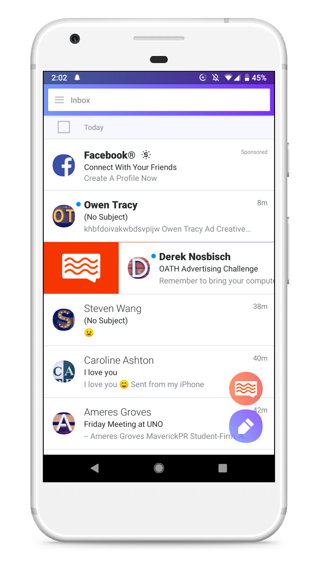
I designed the look and feel of Flex, creating a full digital mock-up in Adobe XD within a 7 hour period.
I also created a rudimentary design language that followed Yahoo Mail’s pre-existing brand guidelines, while moving the design language in a more youthful direction. The functionality of Flex had to be intuitive, so I looked at how Yahoo Mail currently functions, and decided to implement Flex with a simple swipe to the left. This would mark a mail conversation as a Flex conversation, which would allow users to use Yahoo Mail as a more informal messaging tool.
Yahoo Flex is a double entendre
It is meant to both lend a new flexibility to email that wasn’t present previously, and it has the built in social cache of “flexing” on your friends. For this reason, we thought that it would be a fitting name for attracting a younger audience.
We envisioned an advertising campaign using Yahoo Mail’s data resources to deliver clever advertising solutions.


