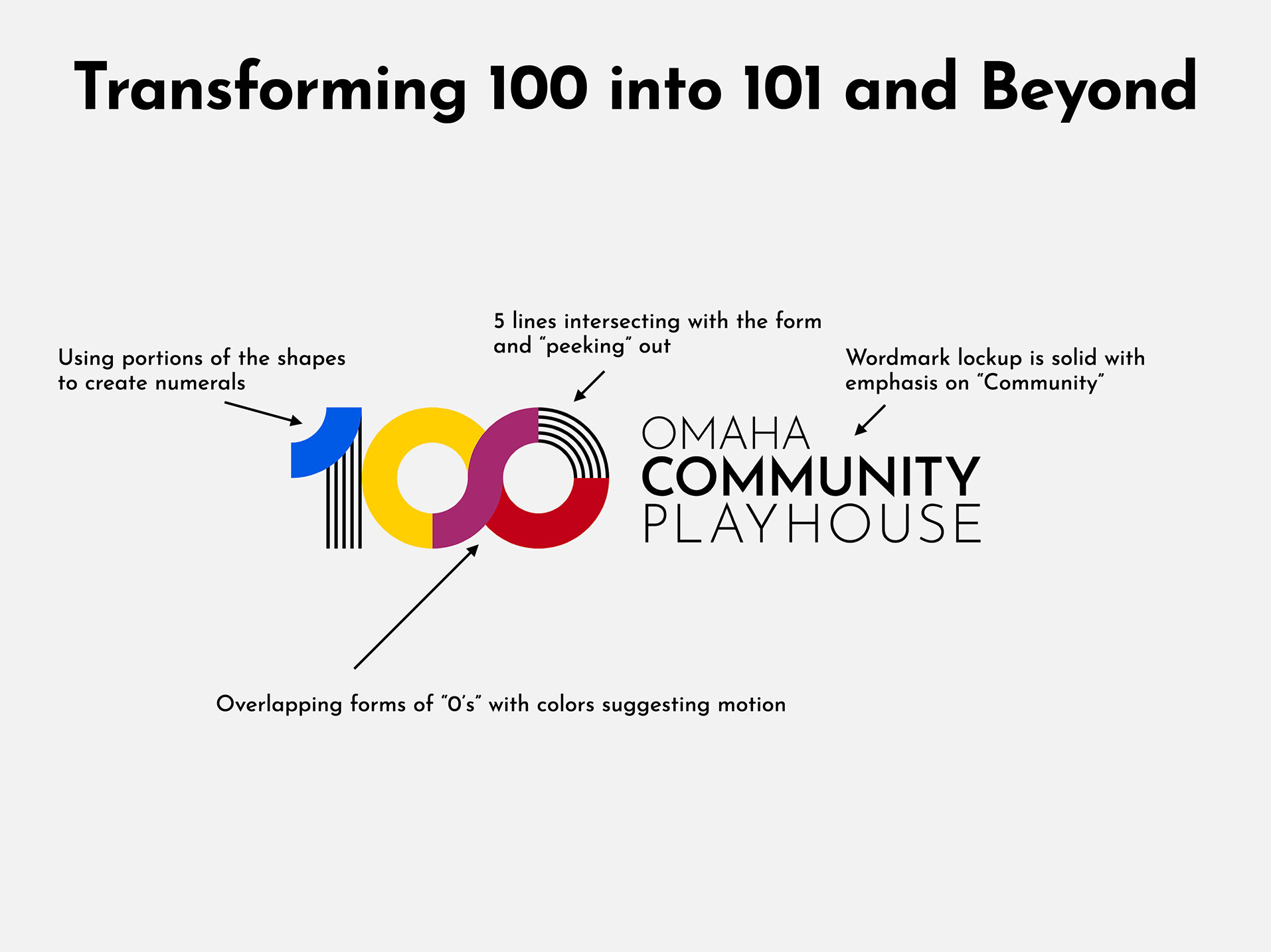
After a strong reception to the 100th Anniversary logo from the community, the mandate was clear. The colorful, playful visual identity was here to stay. But the question remained – how to adapt this direction to a new, more permanent identity?
I explored several options, eventually narrowing down to three distinct logomarks which iterated on the 100th season logo in differing ways.
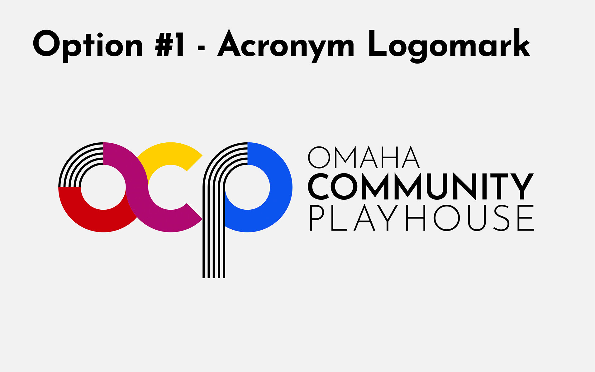
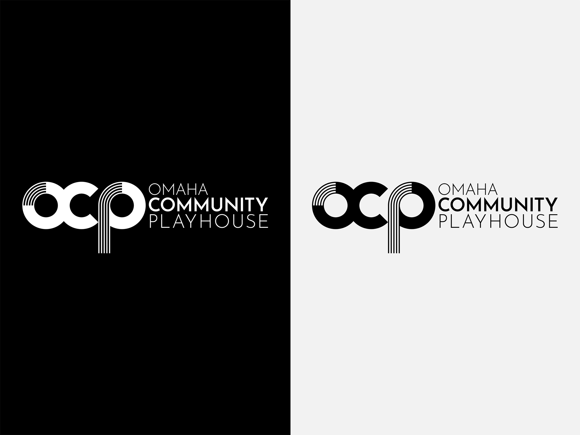
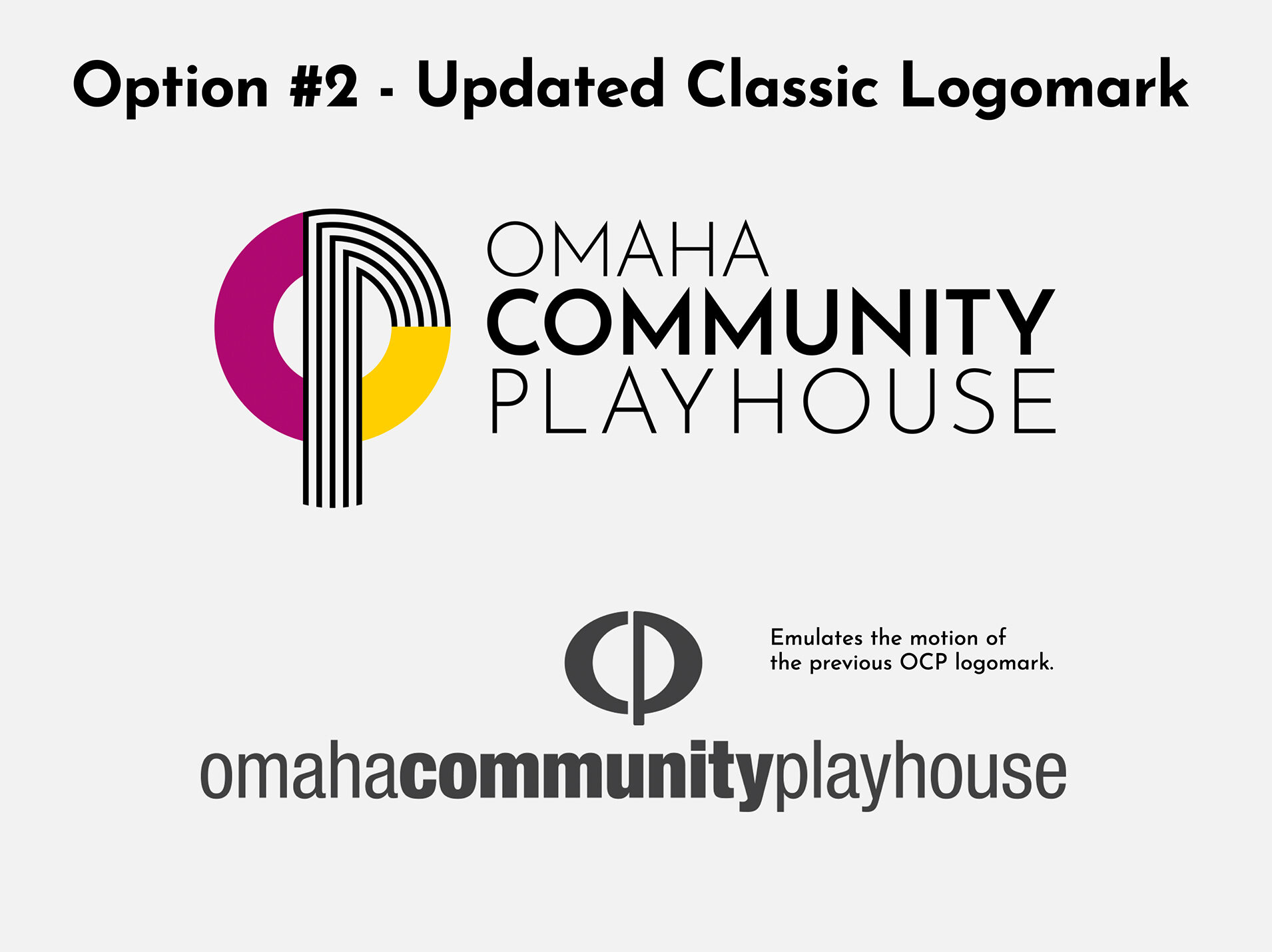
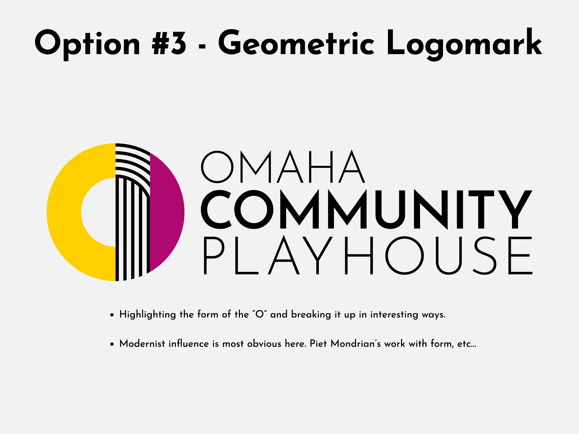
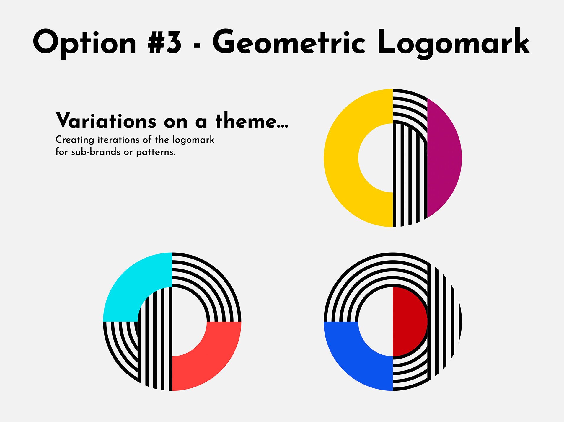
Multiple conversations with stakeholders later, and the second option was the clear winner. It evoked the previous brand identity, while tying in the colorful, modernist nature of the 100th logo. It was approved after some light revisions, and is slated to go live in July of 2025!
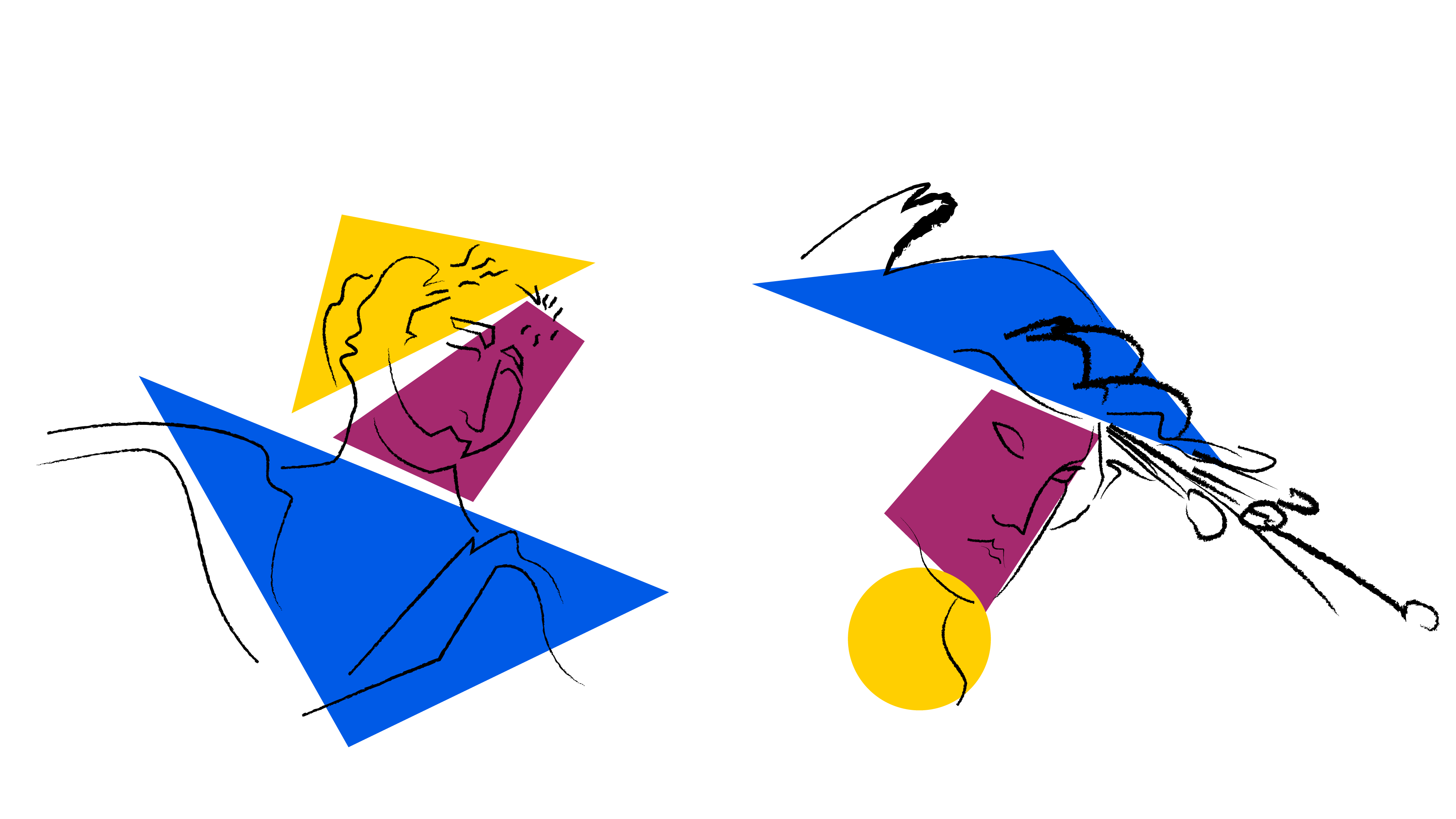
This style offers flexibility, and the opportunity to reinterpret classic symbols associated with the playhouse!

For Season 101, I put together temporary artwork in the new brand style of OCP. This gif represents some of that process


