Jersey Boys
August 2024
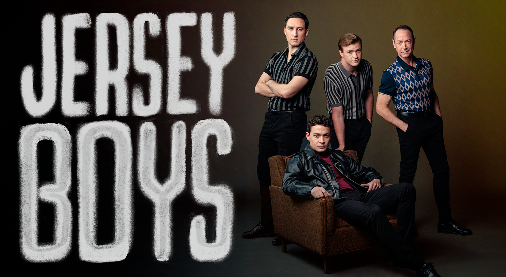
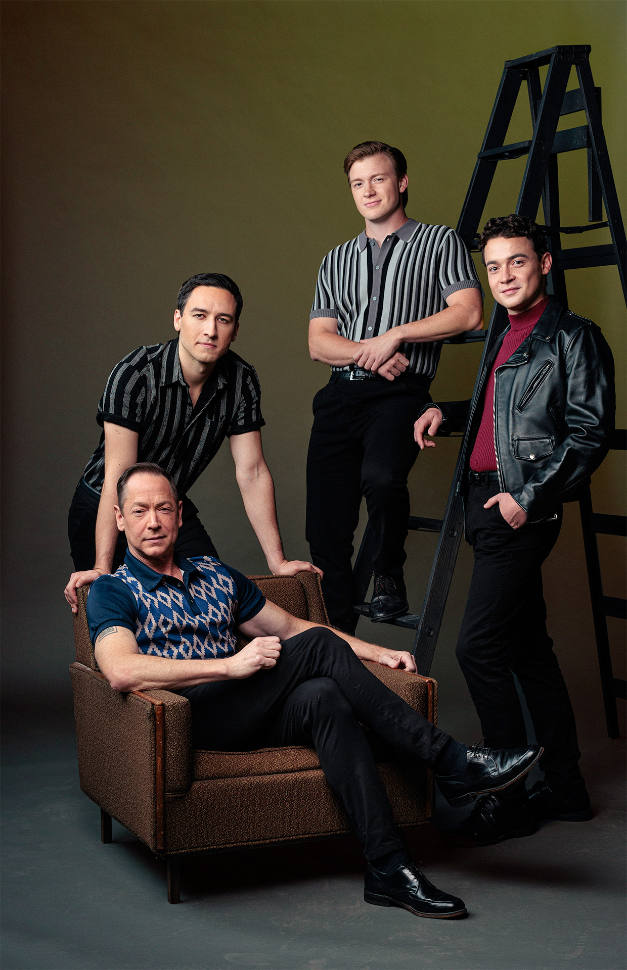
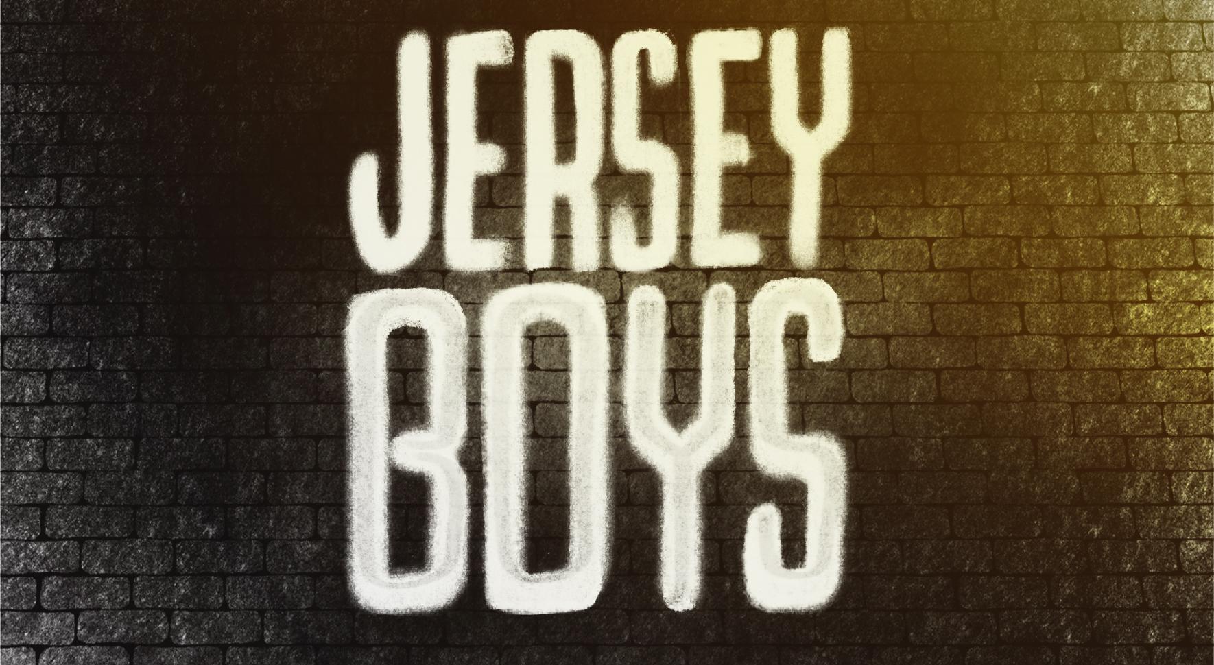
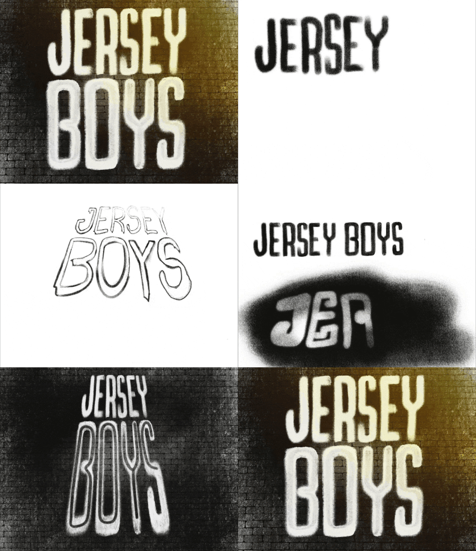
With such an iconic run on Broadway (and a successful feature film), coming up with a new look for Jersey Boys was a tall order. I went through several iterations before landing on a “grafitti tag” style that fit the industrial, noir mood of this specific production. The photoshoot went for an editorial style, allowing for the actors to inhabit their roles and play as if they were The Four Seasons invited to a photoshoot.
Angels in America
Part One: Millennium Approaches
September 2024
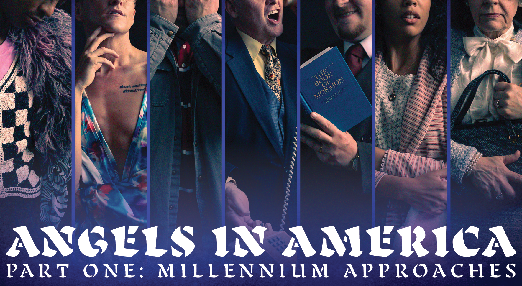
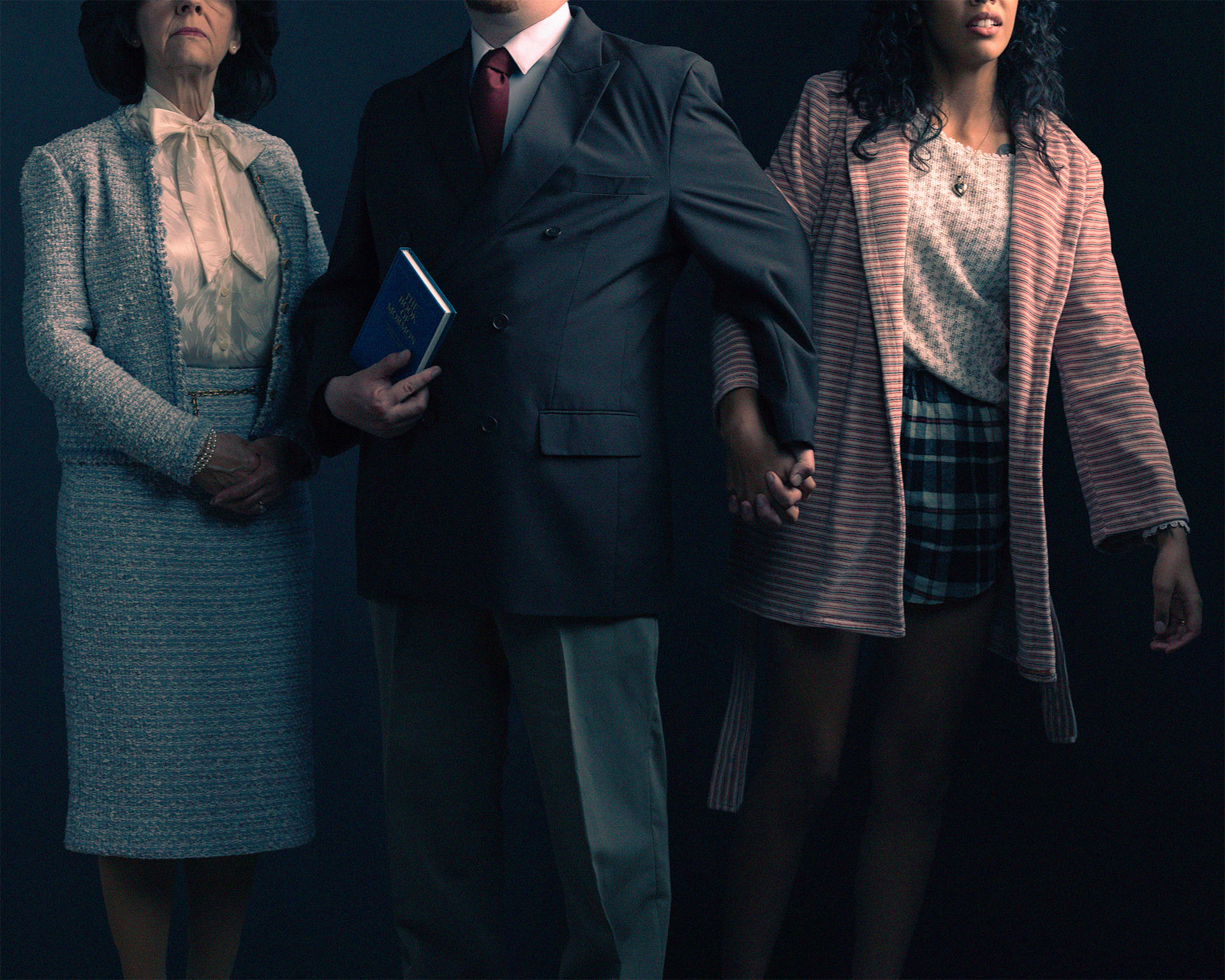
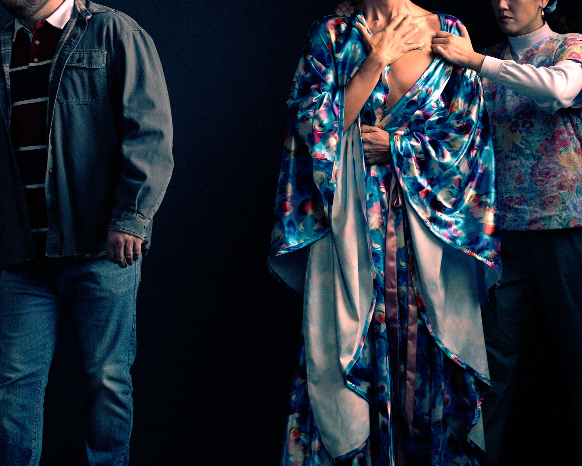
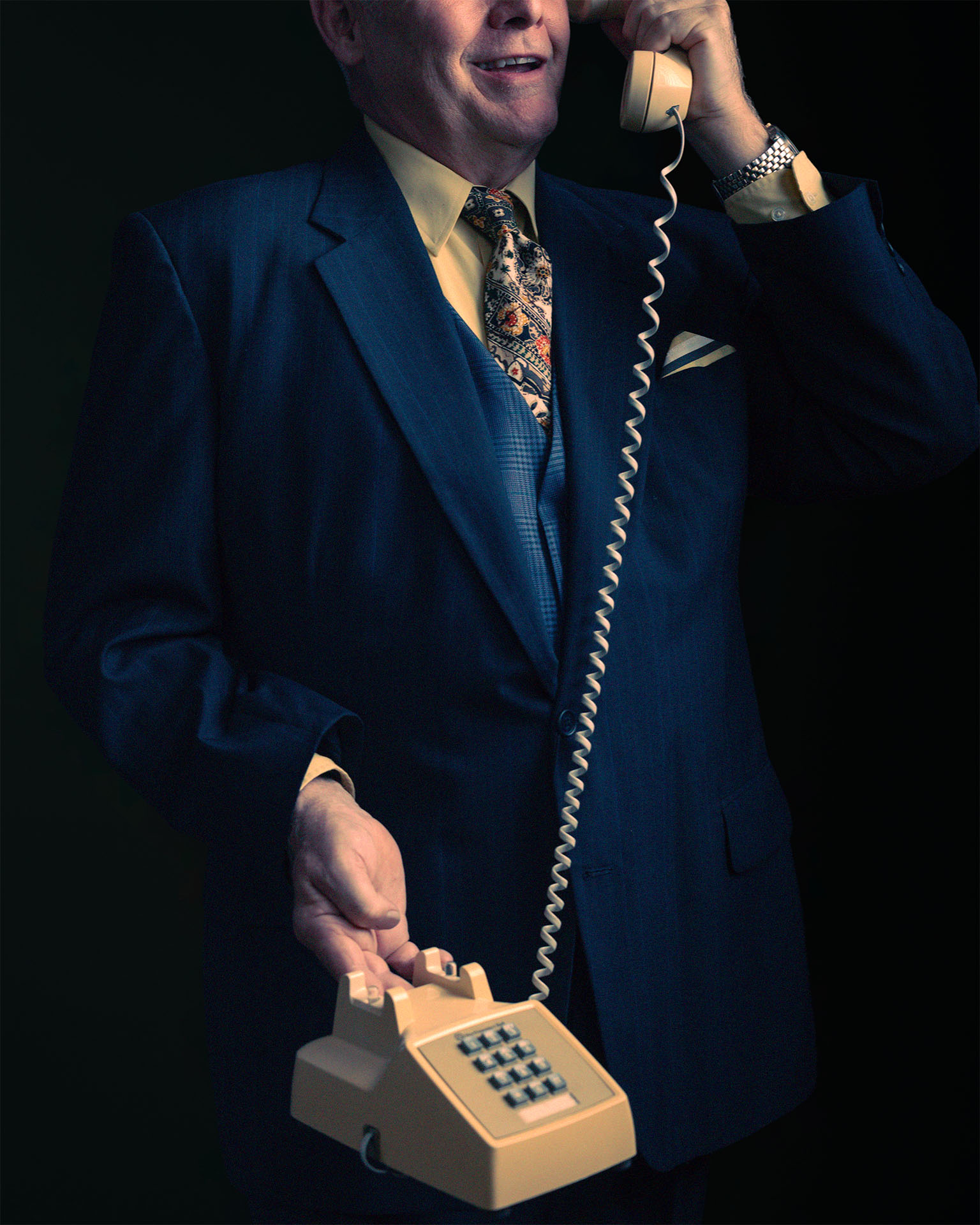
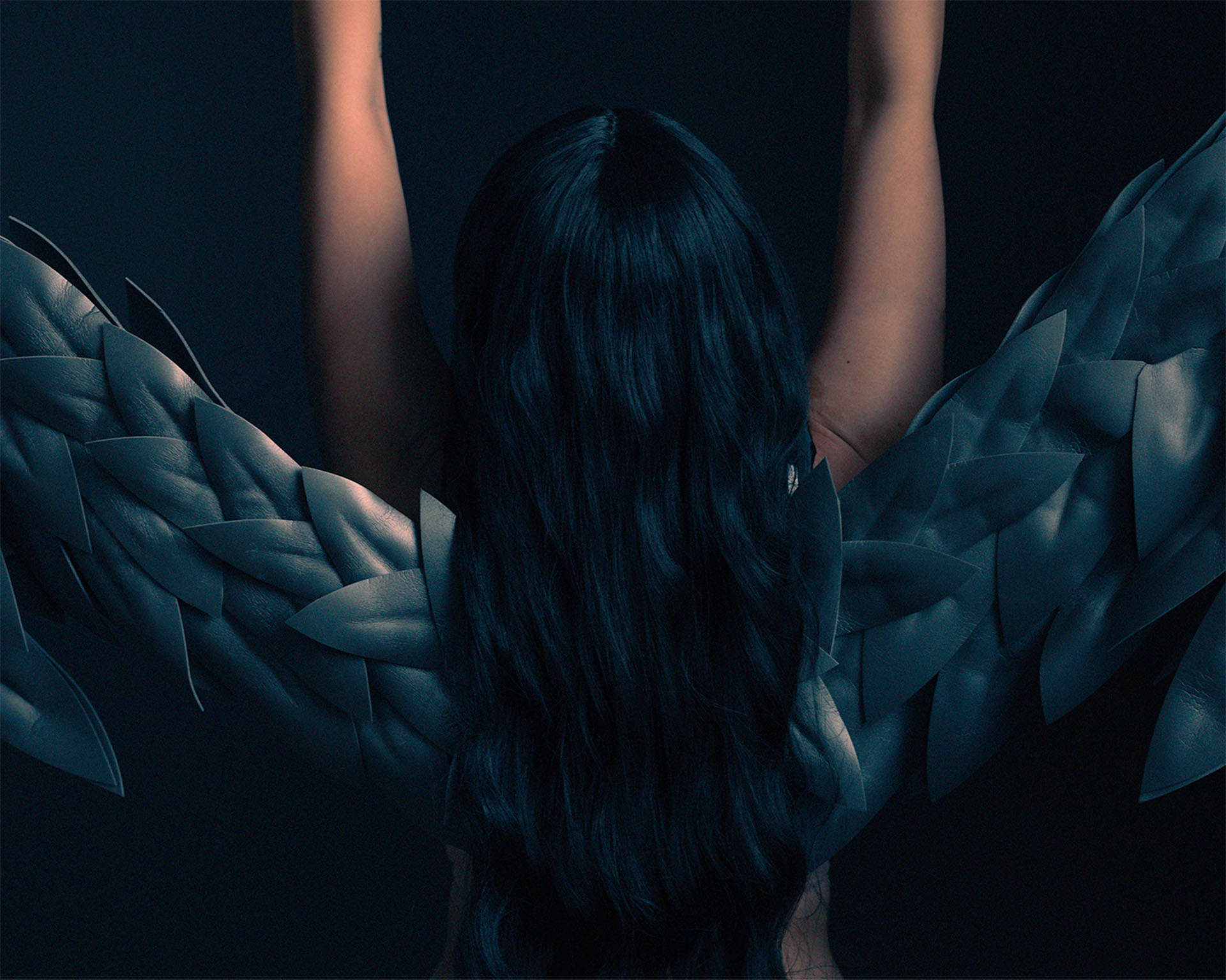
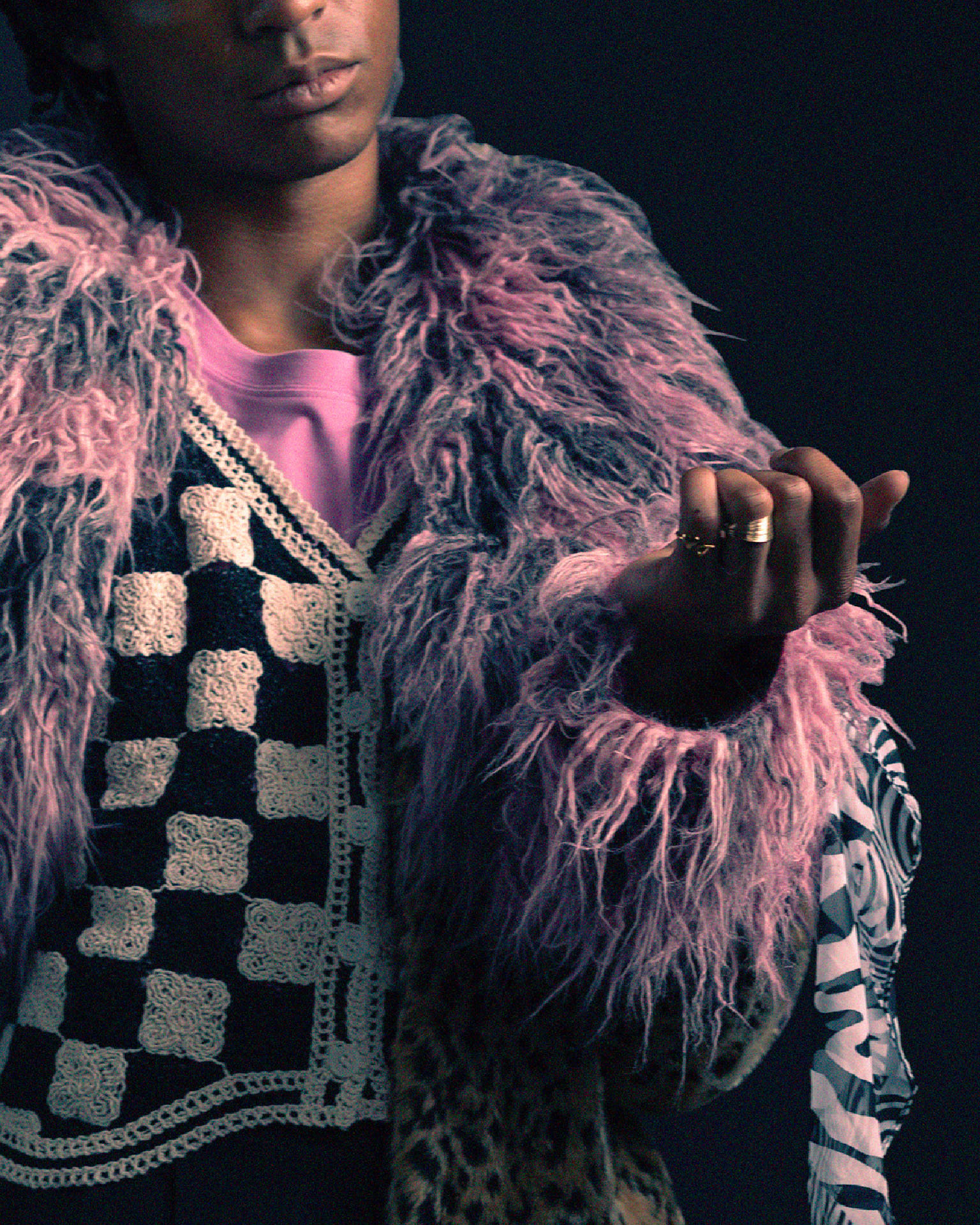
Though the struggles of the AIDS epidemic seem distant, the themes and morality that Tony Kushner touches on in this play are, sadly, still very contemporary. Love and loss, heaven and hell, and an exploration of mortality are tough to grapple with. The artwork grappled with the concept of “justice” being blind. This motif is repeated in the photography, which explicitly doesn’t show the eyes of each of the characters, to ground the viewer in their situation and let the costuming and posing tell the story.
Waitress
December 2024
“This is a hole-in-the-wall, small-town diner – not Master Chef.” was the instruction that I was given when designing for Waitress. As a big-hearted musical that touches on women’s empowerment and following your dreams, the artwork had to feel cohesive with the story that it was trying to tell. So the idea of a diner ticket came about.
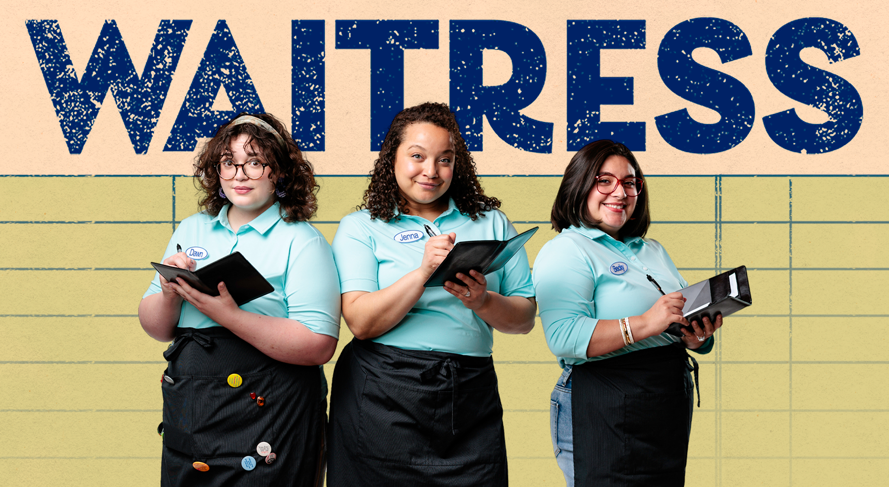
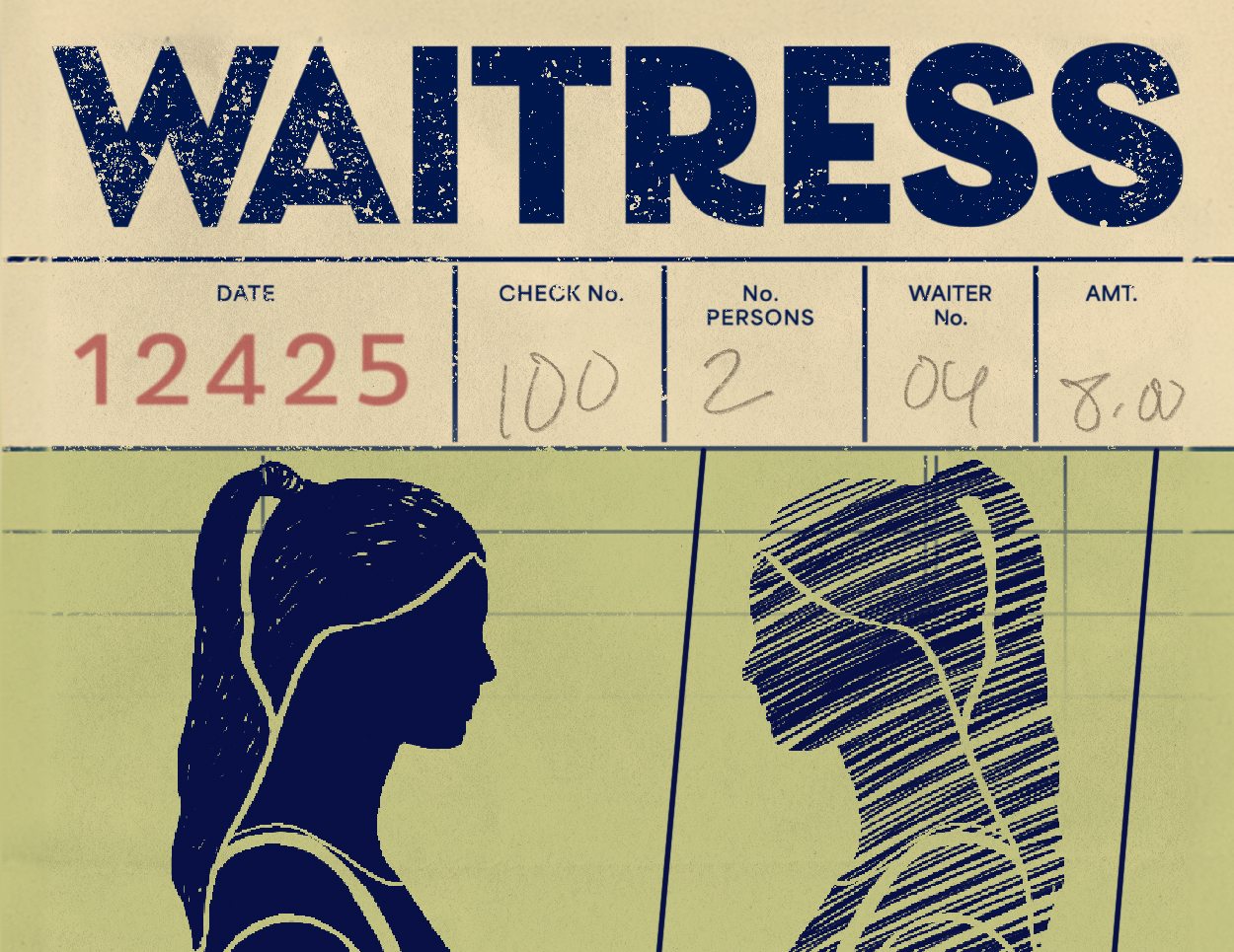
The illustrated key art was inspired by old-school diner tickets, with the image of the protagonist Jenna facing a mirror version of herself, as if she drew it on the stub with pen.
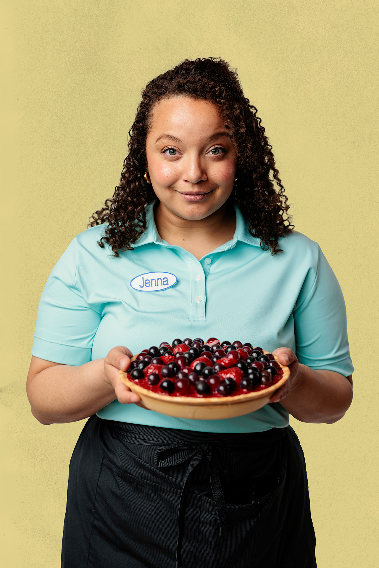
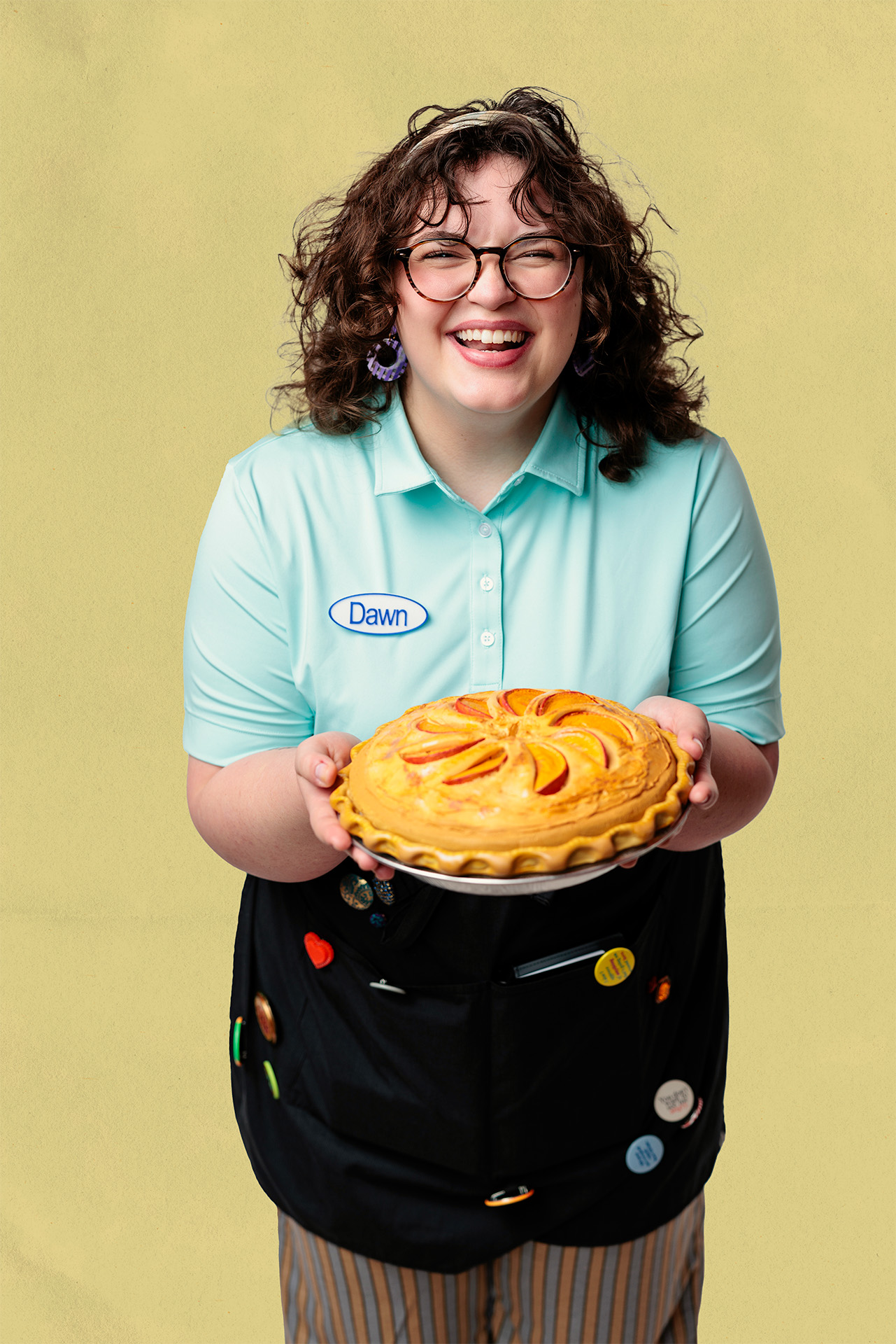
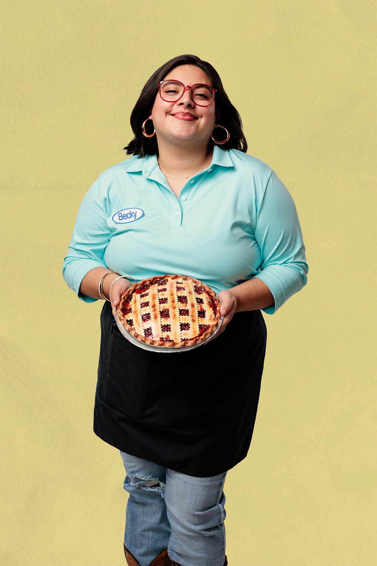
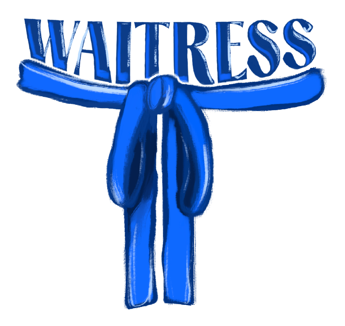

Pictured (Left and Above): Two alternate designs that were considered as part of the process for creating the key art.
Dot
January 2025
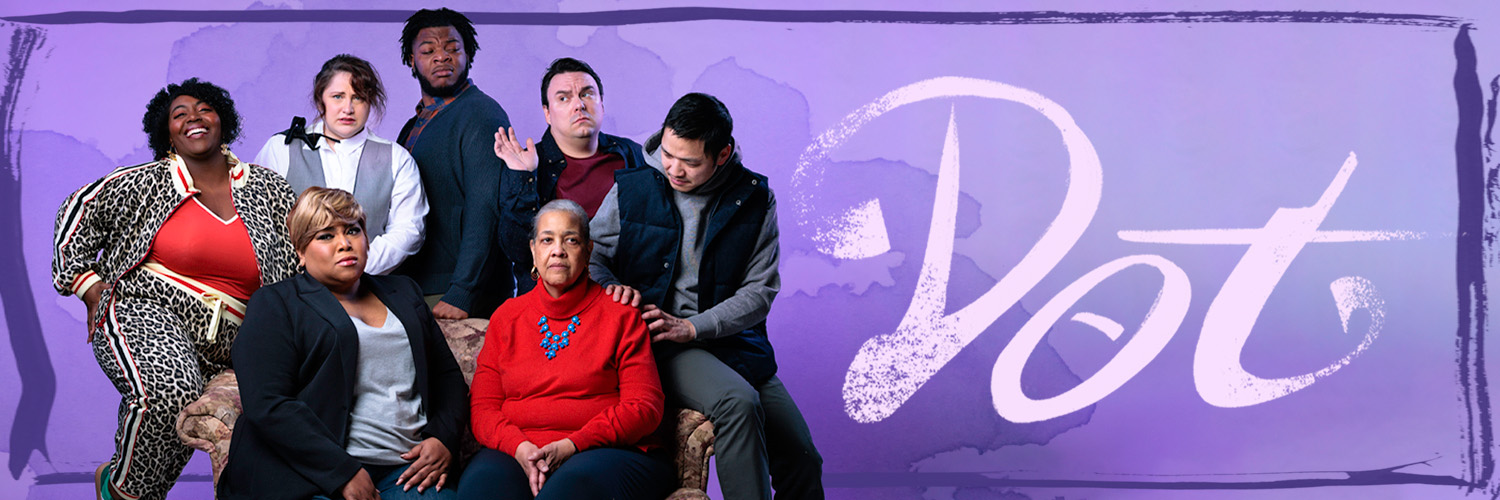
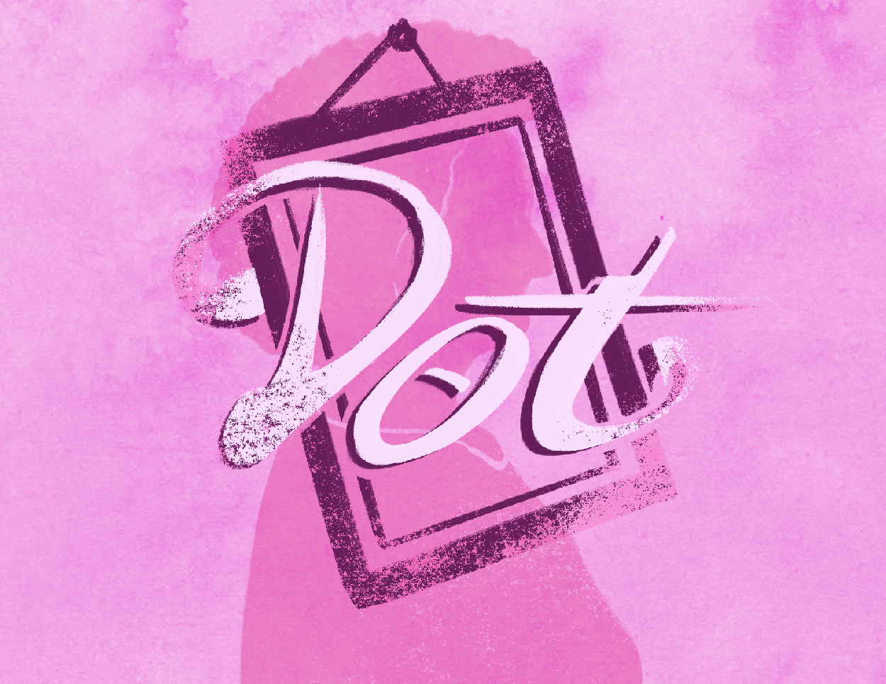
Dot is the story of a blended family grappling with their matriach, Dottie, and her cognitive decline due to Alzheimer’s. It’s full of laughter and love, but also those tense family moments that come about when everyone hasn’t seen each other in a while. For Dottie, her pictures help bring back her memories, so utilizing a picture frame with a silhouette in the artwork felt obvious. The watercolor effect felt in line with the hand-drawn aspects of other shows I had designed. And the logotype creates a pill in the O, as Dottie struggles with remembering to take her medicine during the show.
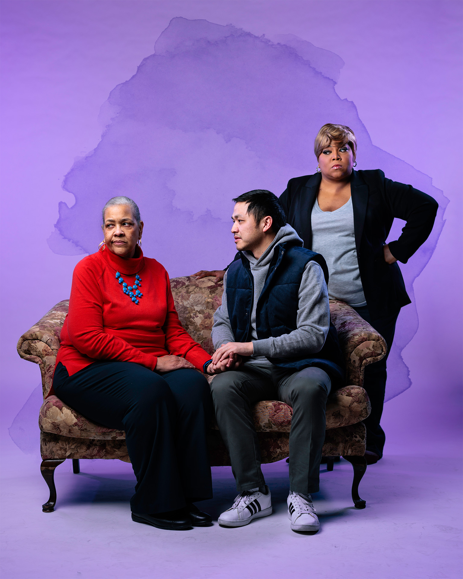
The photography for Dot included all of the cast members. Confining them to the space of a single sofa to act out all these fraught relationships was instant gold.

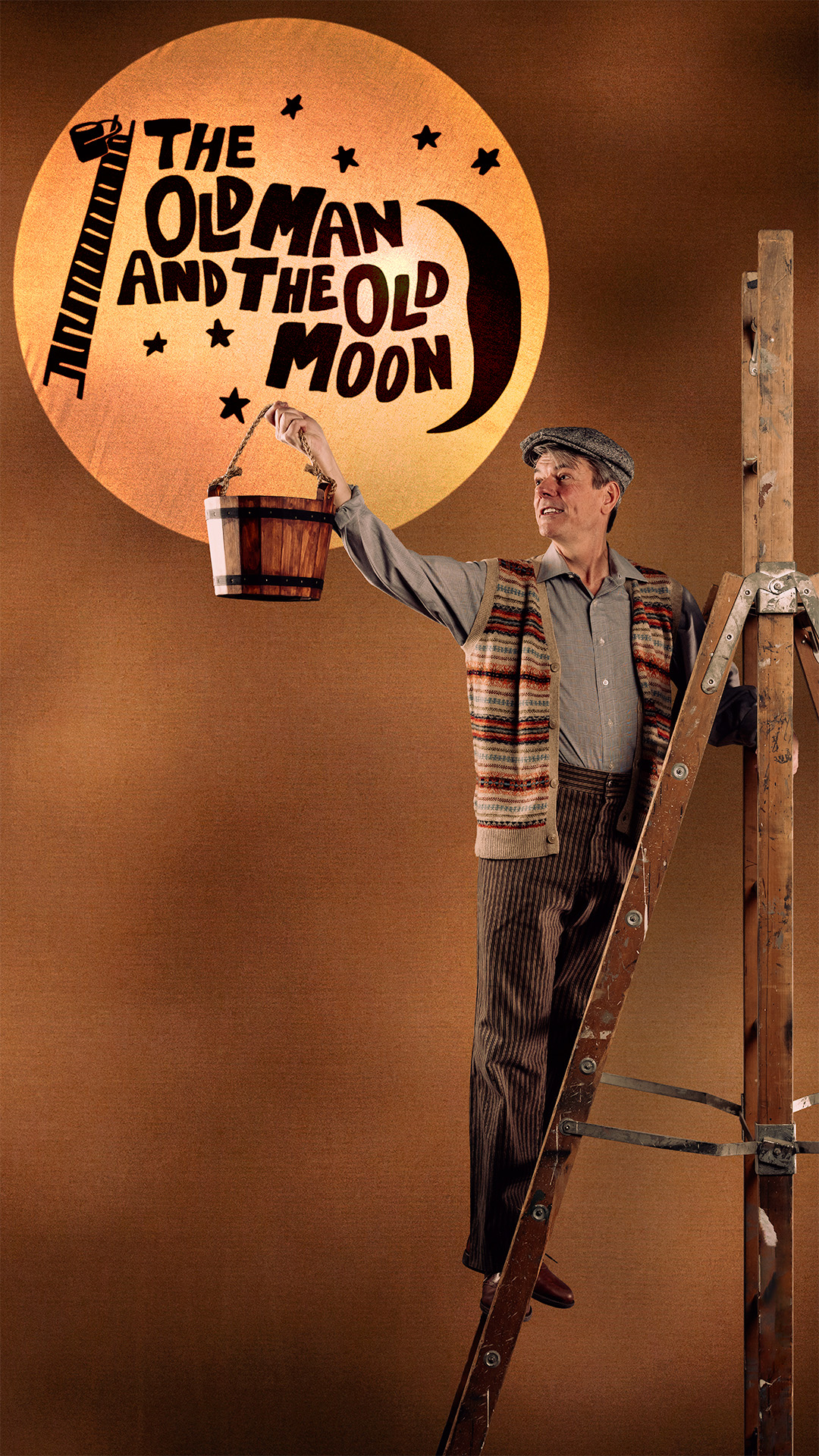
The Old Man and The Old Moon
February 2025
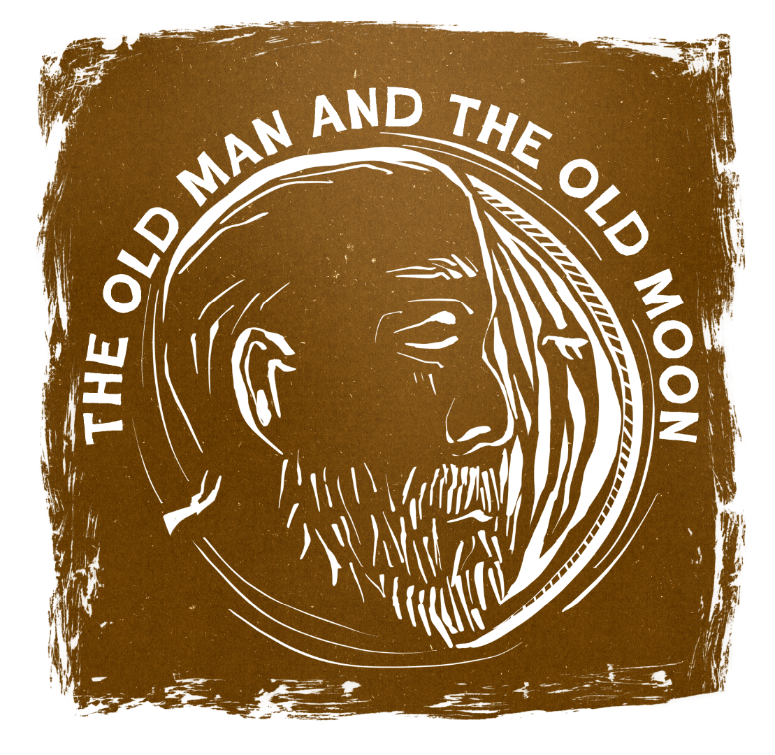
Being able to design for a show with whimsy at its core was a great change of pace from the more dramatic shows of this season. The Old Man and The Old Moon is a play with quite a bit of shadow puppetry and DIY projection work, and the director requested that be reflected in the artwork. Riffing on that idea for the photoshoot, we had the featured actor climb a 12ft ladder and interact with projections onto a moon which was cloth tied over a hoop. Whenever possible, I tried to lean in to that impulse.
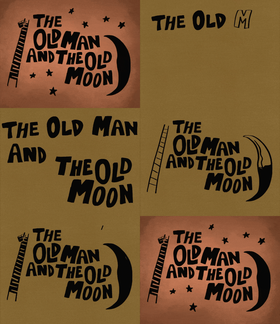
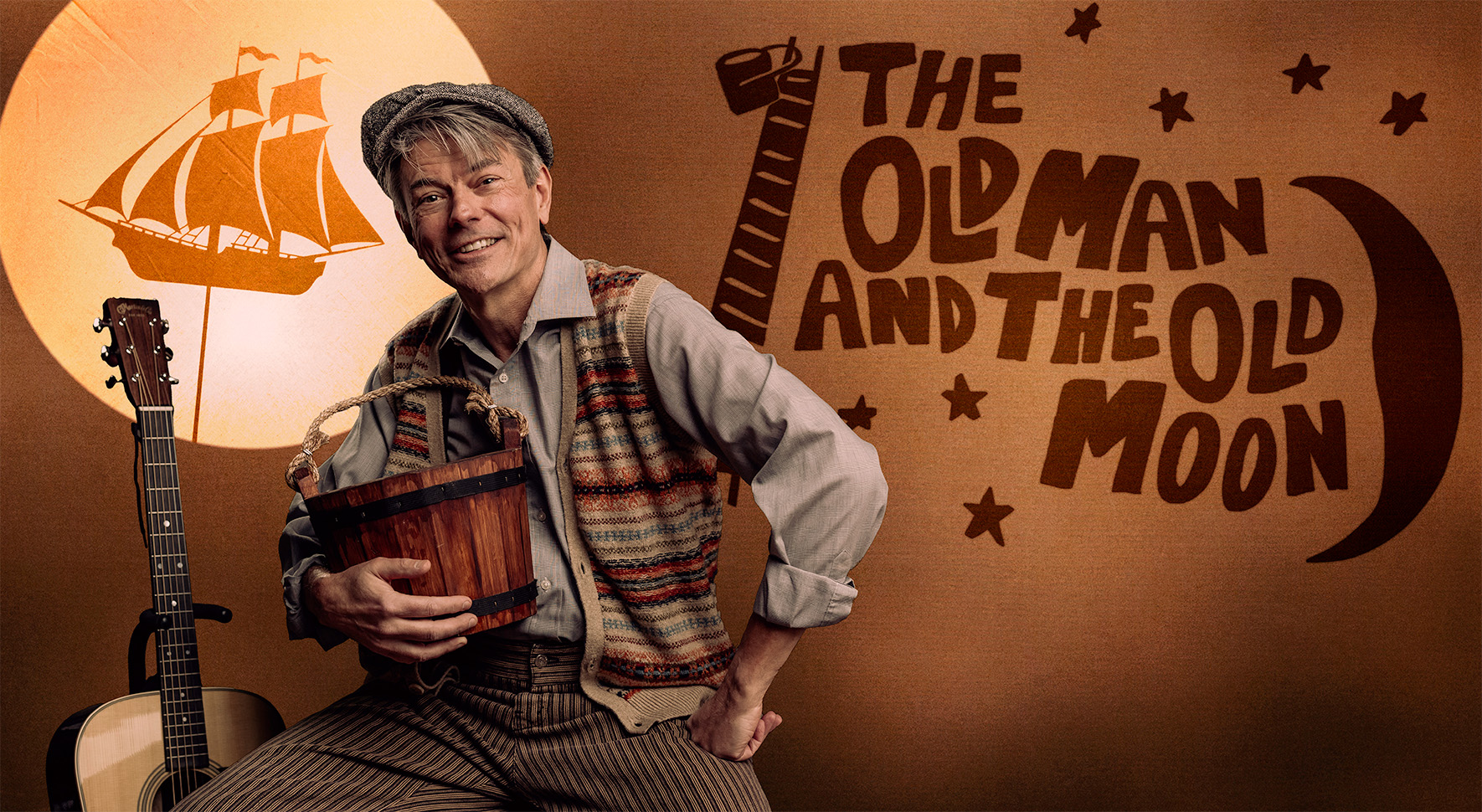
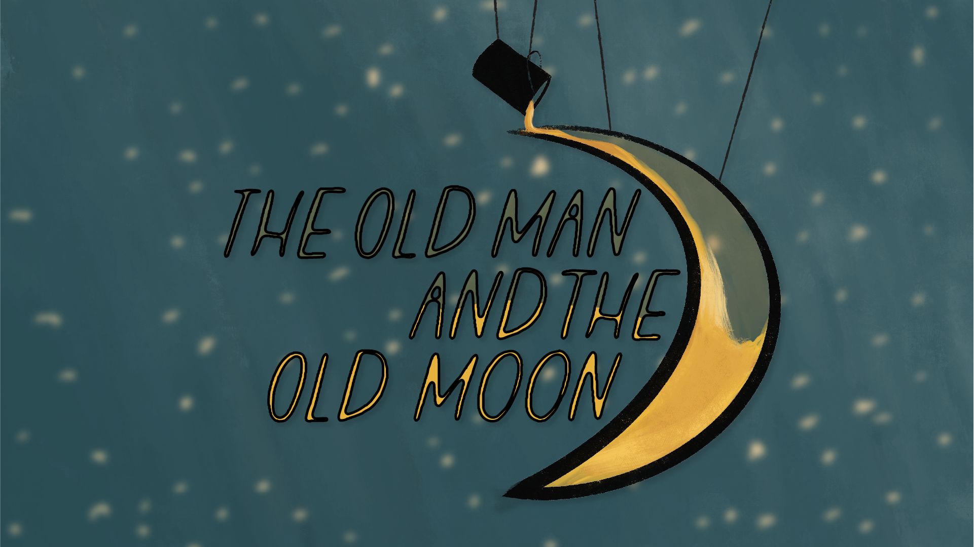
Some of the alternate designs I came up with for the show’s artwork in the concept phase are below. Neither was as close to the director’s vision as the one that was eventually chosen and used with the key art, but I thoroughly enjoyed making them!
Jimmy Buffett’s
Escape to Margaritaville
March 2025
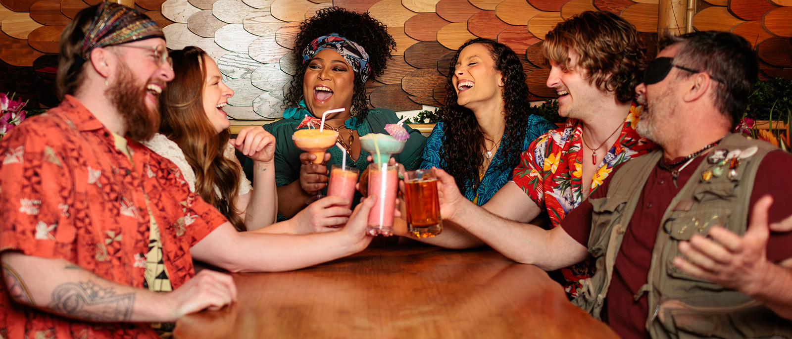
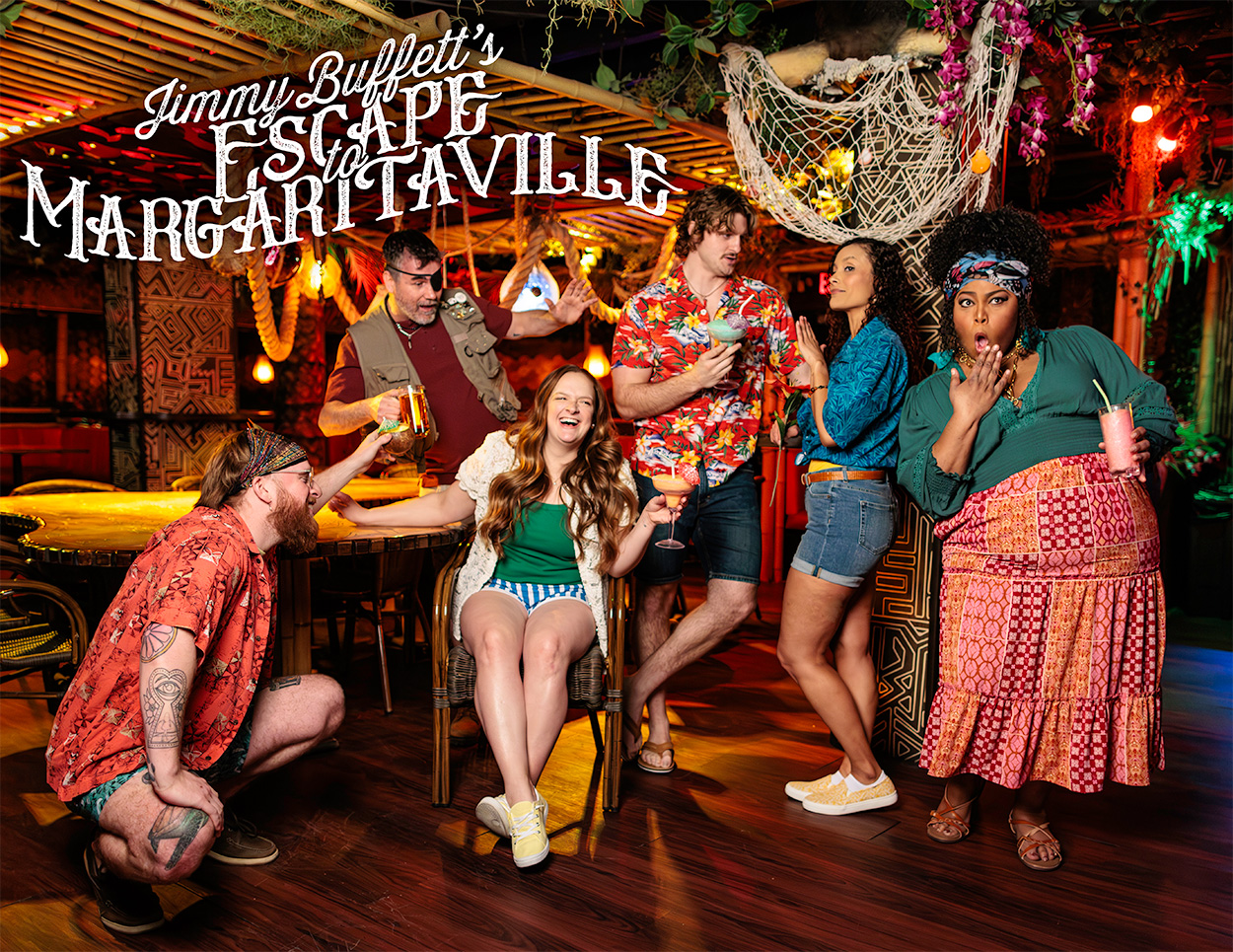
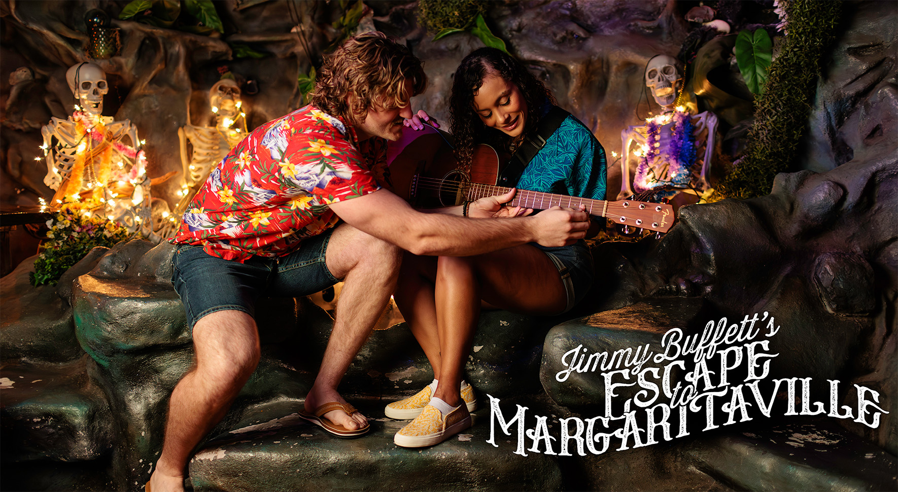
When you think Jimmy Buffett, you think of the Florida Keys, relaxing on a beach, and going out to tiki bars at night with friends. So in order to capture that vibe, I secured the only tiki bar in Omaha, NE for the promotional photoshoot. Escape to Margaritaville is a jukebox musical featuring all the classic Buffett songs, and the cast took the “island life” direction to heart.
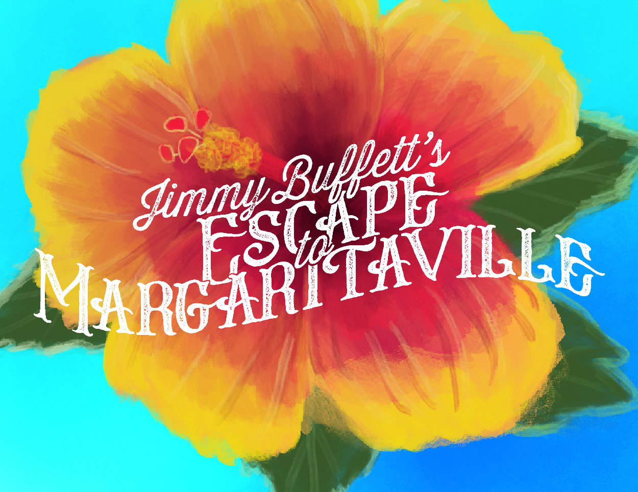
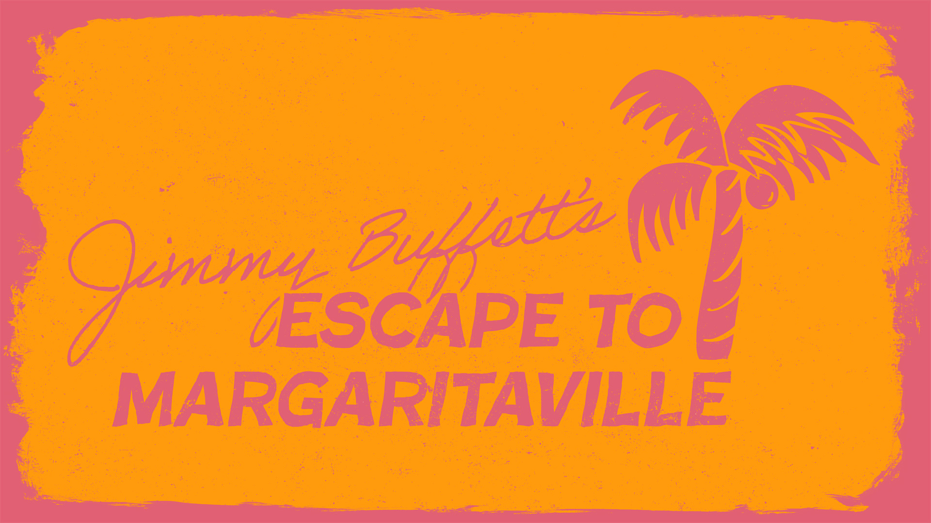
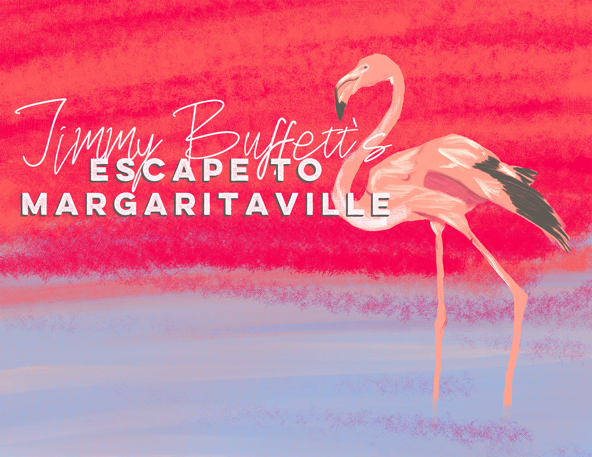
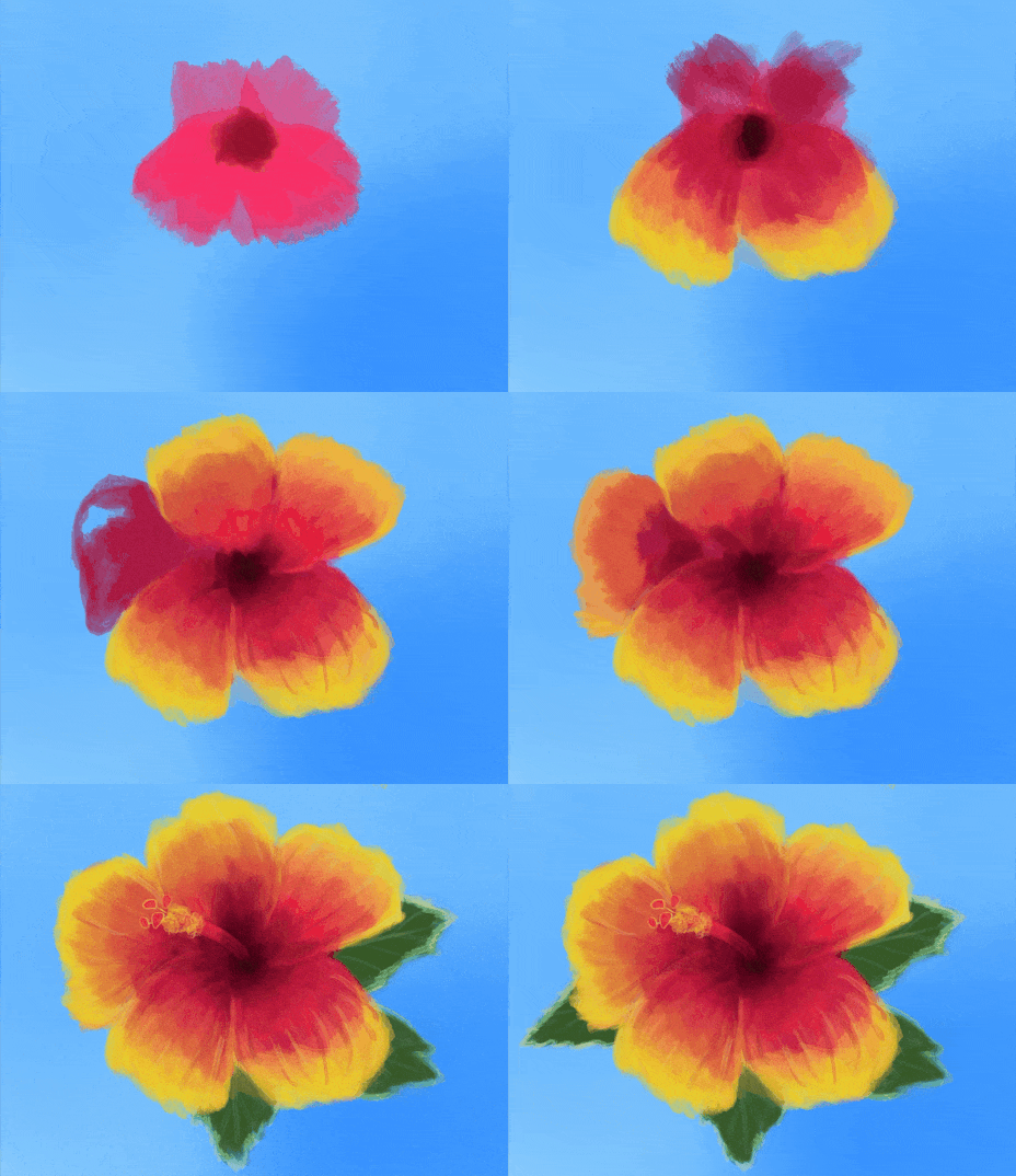
But before the key art was established, I created the show artwork featuring a hibiscus flower. Using procreate, I painted the flower and used that texture in much of the promotional material – tying the traditional Hawaiian shirt motif to the show. The logotype took some experimentation, but I eventually came to a middle ground that I think expressed the party vibe, without dipping too far into the surf shop oeuvre.
American Mariachi
April 2025
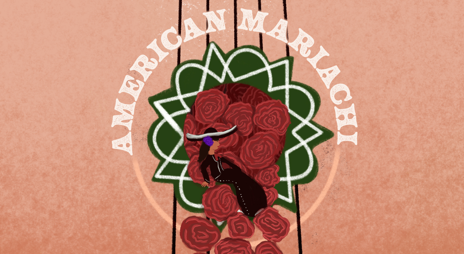
Shattering social norms of the times, in American Mariachi the protagonist Lucha sets out to form the first all-female Mariachi group in the seventies. For a show steeped in Mexican-American heritage, the director asked me to bring in lots of illustrative elements. For the artwork, we landed on the image of Lucha sitting in the hollow of the guitarron, with roses spilling out from within. The colors of the Mexican flag (red, white, green) are also present.
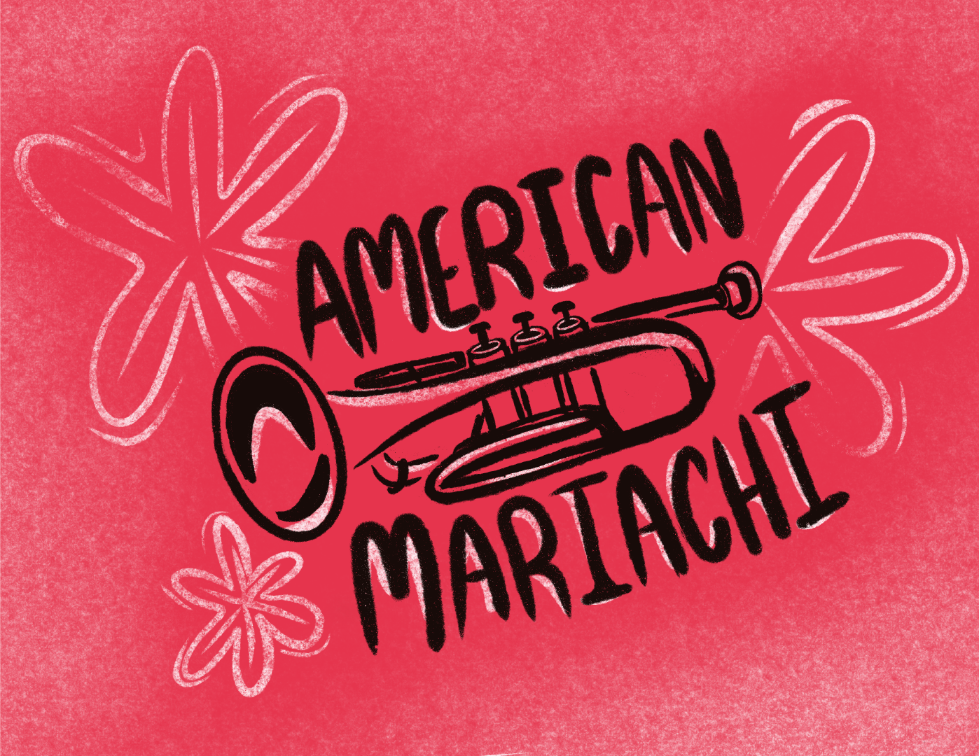
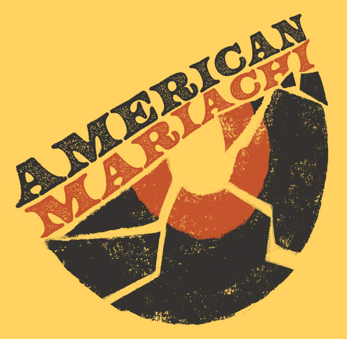
For such a vibrant show, coming up with concepts for the artwork to sell it with was a blast. Below are two concepts that didn’t make the cut, but I felt were very compelling. In particular, the smashed record references a moment in the show and also the norm-smashing tendencies of Lucha, the protagonist.
Titanic The Musical
May 2025
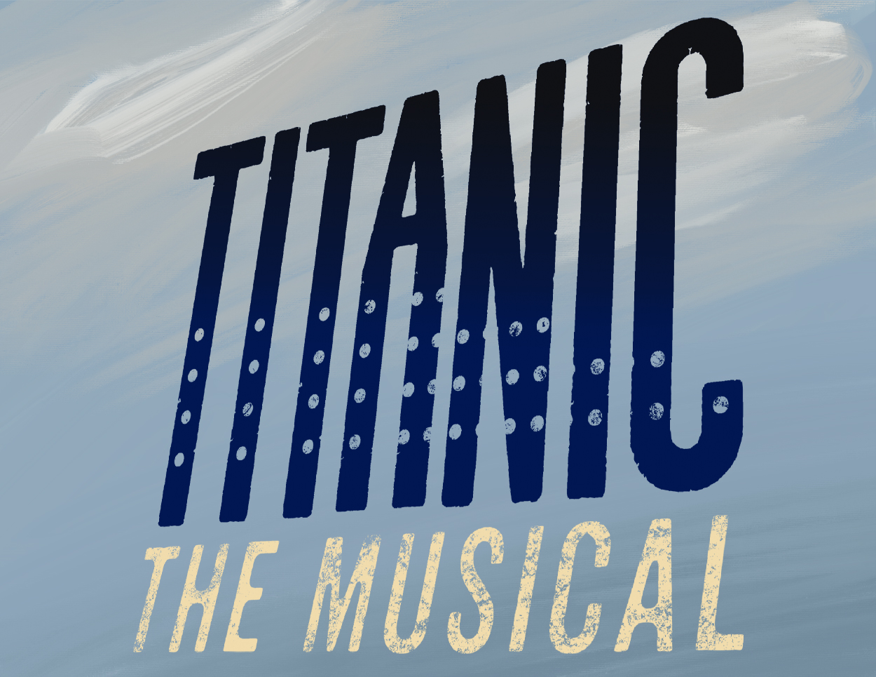
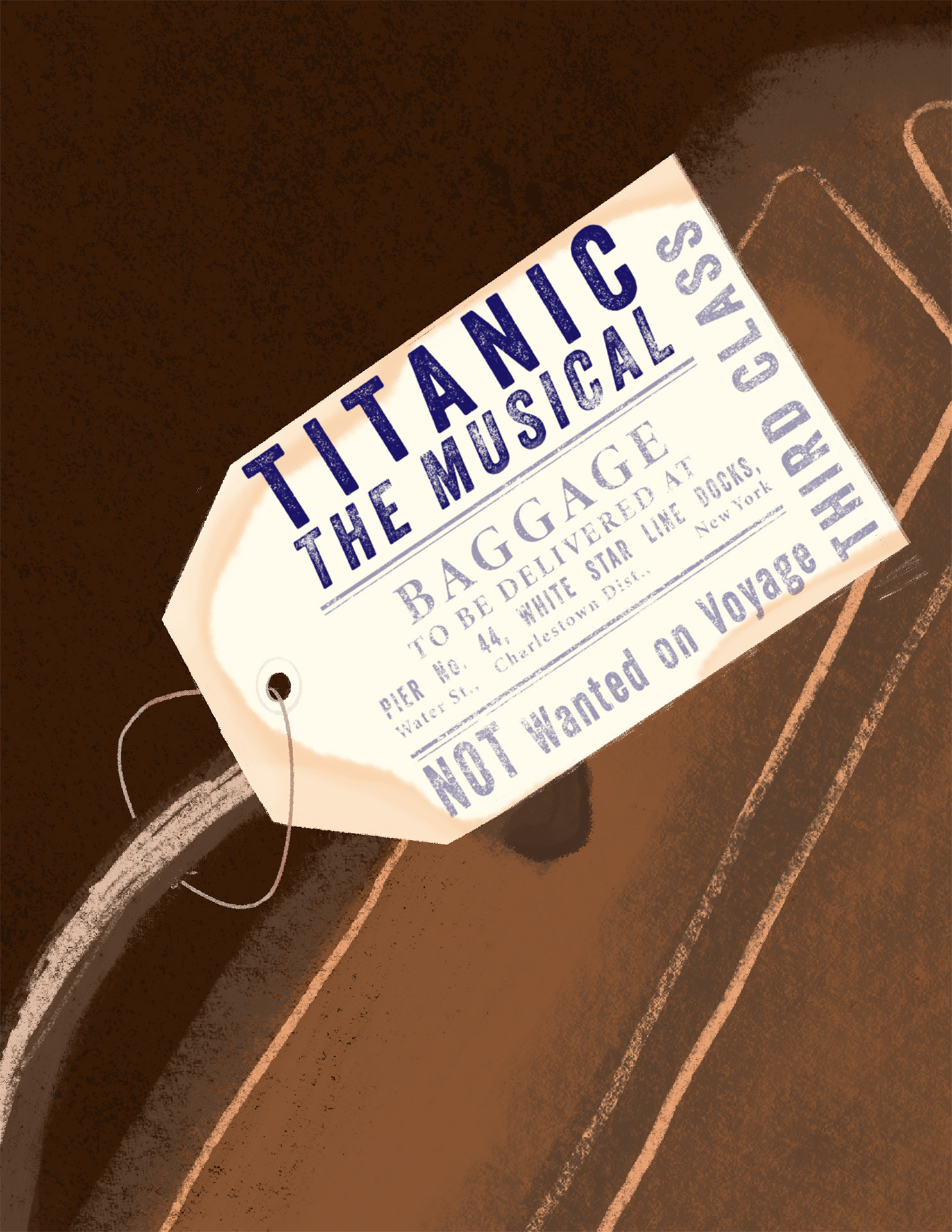
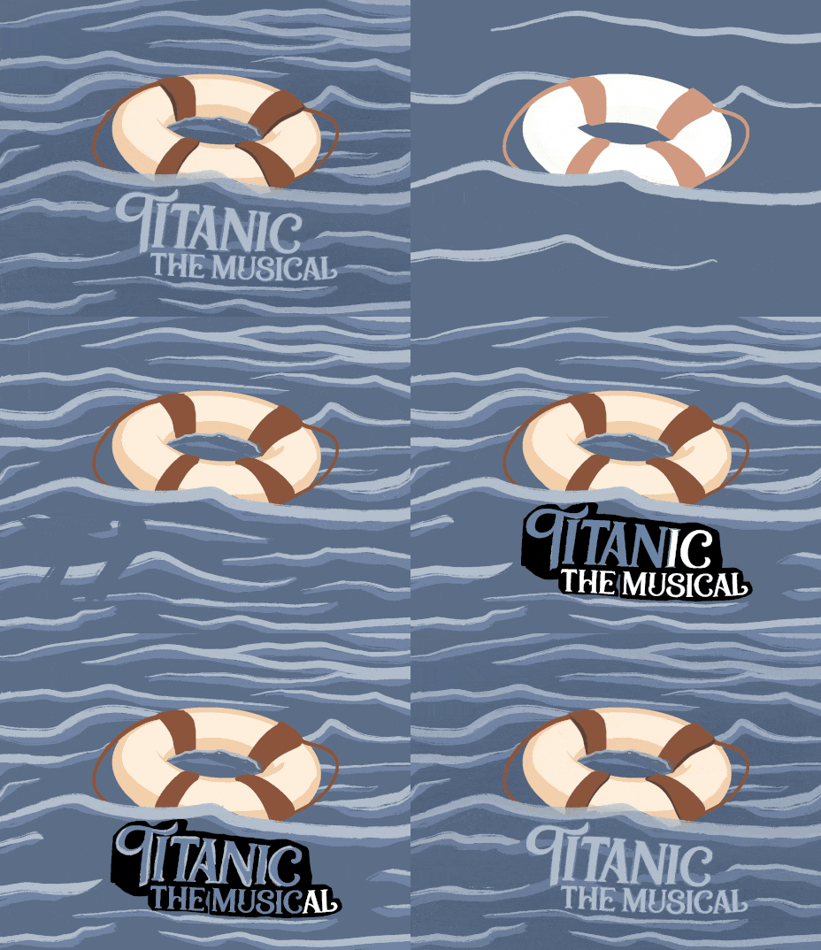
Jack and Rose, this show is not. Titanic The Musical aims to capture the aspiration, and eventually desperation, of that doomed cruise liner. The story encompasses all walks of life aboard the ship, from first class all the way down to the crew manning the ship. The director wanted to lean into the aspirational side of the story, while embracing the enormity of the tragedy. With that in mind, I narrowed down my options from the more illustrated versions below to the simpler logotype – which is a bit more of a blank slate for audiences to fill in.
