The River Bride
August 2025
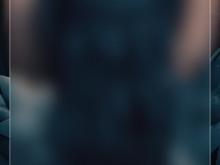
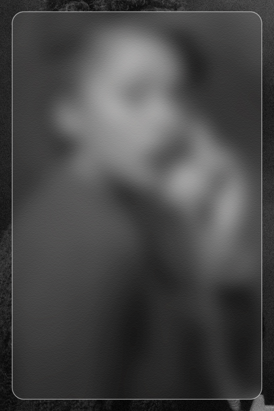
As a show steeped in magical realism, The River Bride required lots of visual research into Brazilian folk art and aesthetics to accurately represent the world of the play. Working with the director and costuming, I art directed the photoshoot to reflect the production design. The flash of pink in the highlights is a subtle hint to the finale of the play, and is only meant to be understood after the fact.


Grease
September 2024
Grease is the word, but what is the visual? Hot rods, milkshakes, butterfly combs, cigarettes, and everything fifties americana is the stereotype, but when the casting doesn’t reflect the traditional stereotypes, how do you make it feel fresh?
Bright colors, grain, and hot rod lightning bolts was the direction I leaned in, with very clear and consistent lighting. Hand lettering the logotype added an extra level of differentiation from the classic hokey logo.


Angels in America:
Part Two – Perestroika
October 2025
Angels Part One in 2024 was one of my favorite shoots to art direct – the intentional crops and tight framing sold the darkness of the story. With Part Two focusing on finding new ways to hope, and the ascension of Prior Walter, finding a way to represent that was key.


A Christmas Carol – 50th Annual Production
November 2025
A Christmas Carol at OCP is an Omaha staple, and getting the opportunity to redesign the artwork for this show was a blessing. The brocade pattern and hand-lettered fraktur type speak to the tradition and history of this show, as well as the balance between the joy of redemption, and the ghost story that Charles Dickens wrote.
I also spearheaded a reunion of sorts, art directing a photo call for ~30 Christmas Carol stalwarts who had been mainstays both on and off the stage for years. These photos were used in a promotional run entitled “The Spirit of Carol”.


August Wilson’s
The Piano Lesson
December 2025
The Piano Lesson was a joy to art direct and design for. The show is centered on an intimate portrait of a family at a crossroads, with the ghosts of their past coming home to roost. Because of that, and the period setting of the early 20th century, I really wanted to lean into ambers, browns, and oranges to create this stark contrast with the logotype I designed.


For the show artwork before it became key art, I drew it as if the ghosts of their ancestors were settling in to the heads of the two protagonists of the show.

HAIR
January 2026
The iconography of Woodstock and folk music from the sixties has been so commodified, that it’s become almost rote. My goal with HAIR was to shake up the elements at the roots of the protest movement, and make artwork that was unmistakably in conversation with it, but accessible to modern audiences. As it’s a show with nudity, the central conceit was to have the cast members *strip bare*, only hidden behind a tie-dye sheet.


Disaster!
February 2026
Taking cues from seventies disaster flicks like Avalanche and Towering Inferno, I wanted the logotype of Disaster! to be the main character. I hand-lettered it, and in doing so tried to give it a sense of tilting out of balance.


For the art direction of the photoshoot, I had our photographer shoot everything in camera, then I heavily edited, cropped, and mashed the photos until the disco ball becomes this otherworldly textural element that looks ripe to push the cast out of frame like a wrecking ball.


Dial “M” For Murder
March 2026
I am extraodinarily proud of the art direction for Dial “M” for Murder. I pulled countless stills from old noir films for the creative brief, and we were able to execute on the concept with minimal difficulty.


The rotary dial and logotype are evocative of Saul Bass illustrations for Hitchcock posters, because if it isn’t broke…
Mary Poppins
April 2026
I had quite a bit of fun designing the show artwork for Mary Poppins. It’s meant to be evocative of the Disney classic, but with a bit more of a storybook feel.
For the key artwork, we leaned into the classic Disney vibes, and using a sky background drop (that was actually rigged for Disaster!) I created the illusion of Mary “flying” before she actually was attached to anything.